

Designs & Illustrations
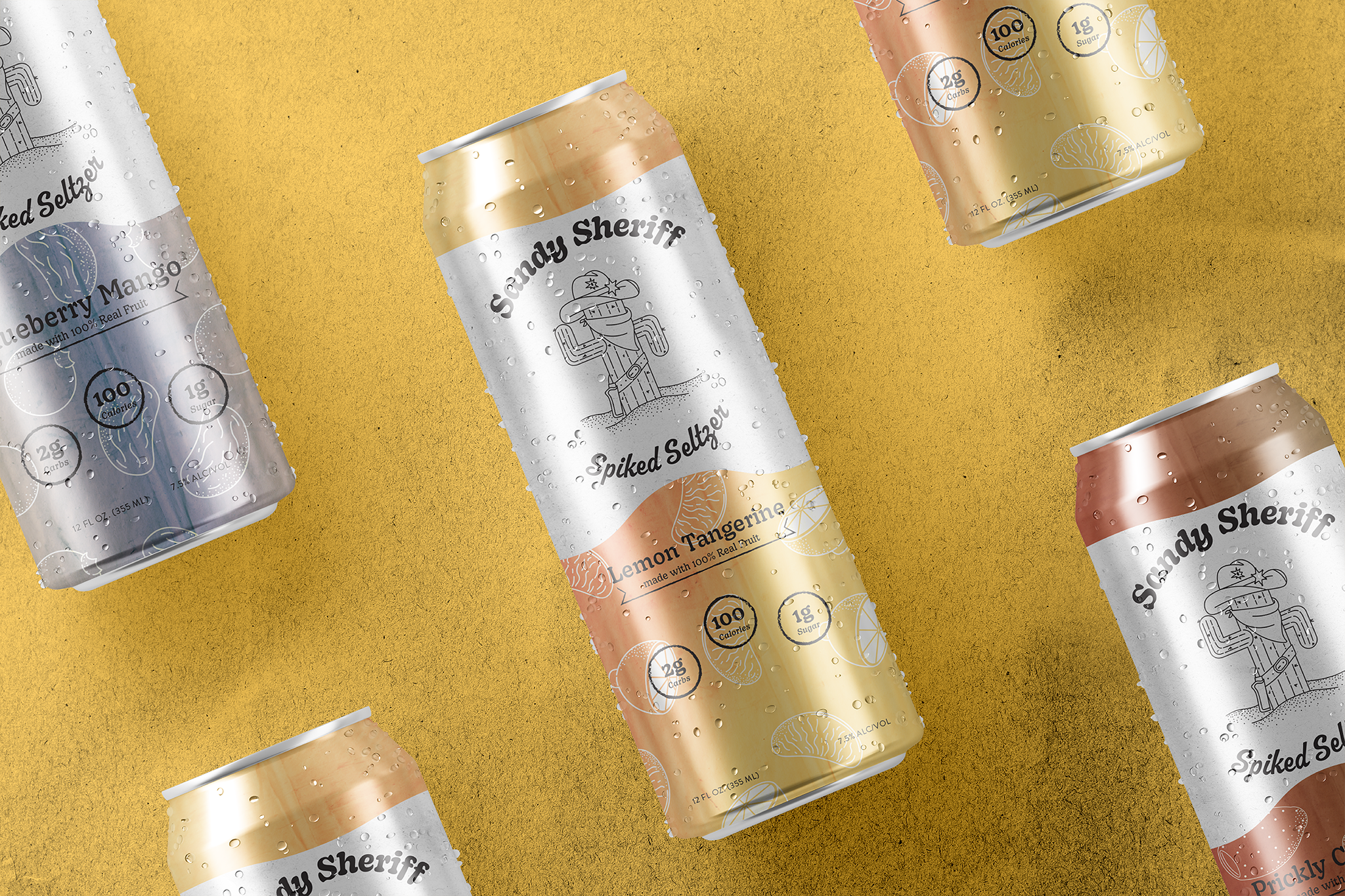
Sandy Sheriff spiked seltzer
As my first case study, I wanted to understand and identify what makes an appealing logo/design stand out to the general public. I looked over references, different trends that younger/more mature audiences followed in the past recent years.
The biggest trend was simplicity, as many brands have shifted from heavy design elements to only using a certain few, though this is not exclusive to every brand. I decided to do the ladder, making it simple but aged, adding texture and patterns that can enhance the design whilst also being much more appealing from affar.
During this time, the market was growing in seltzers and canned drinks, and decided to move in that direction for this project.



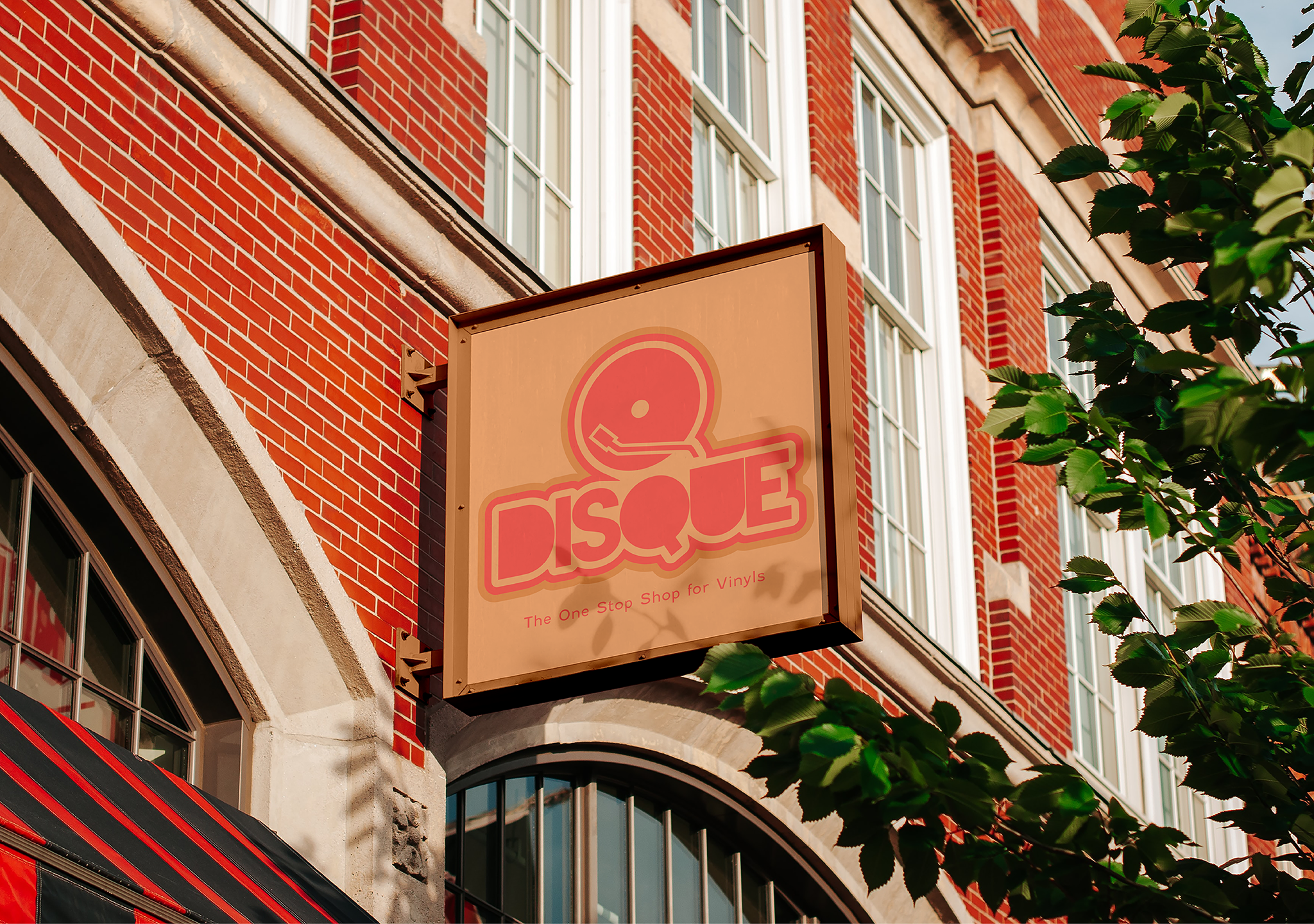
Disque - physical music shop
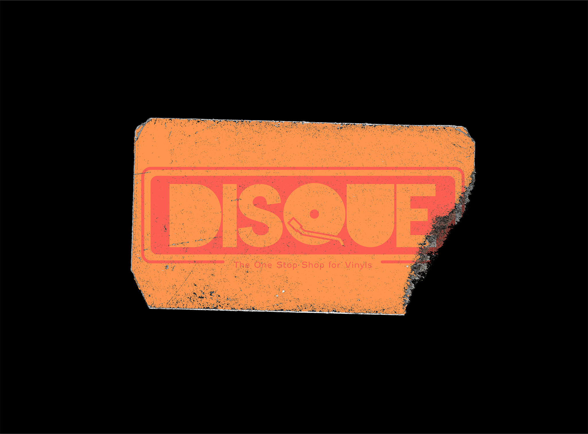
As I got into more interests, I decided to try and make physical and digital assets for a smaller company called ‘Disque.’ The purpose was to design multiple or a small amount of assets to introduce people to the store and bring in an ‘old-school’ look as its main selling point were the vinyls, LPs, disks and other physical medial.
I took design inspiration from multiple places, more noteably the more local locations in Fort Collins, CO. I decided to go for a more modern and sleek look. All assets other than images, textures, and mock-ups are all done in Photoshop and Illustrator.


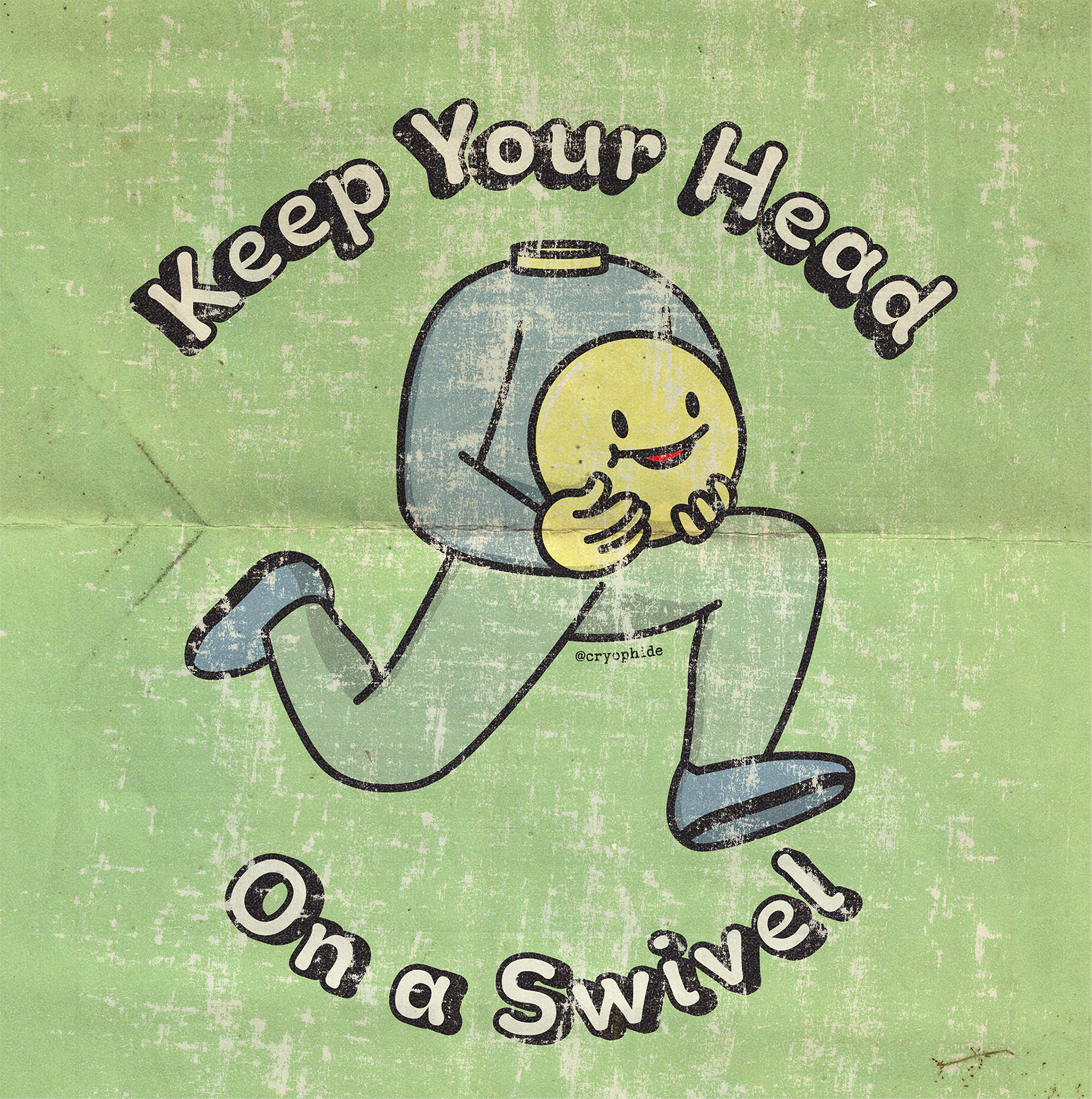




From sketch to inbox, your passions can be realized in more ways than one!